Making Sense of Custom Colors
Over four years ago, the blog post Colorization: It’s Not Just about Eye Candy covered the basics of using color. However, v6.1’s Custom Colors feature goes way beyond Studio One’s original way of handling colors.
The Help Viewer describes Custom Color operations, so we’ll concentrate on the process of customizing colors efficiently for your needs. For example, my main use for colors is to differentiate different track types (e.g., drums, synth, loops, voice, guitar, etc.). Then, changing the color’s brightness or saturation can indicate specific attributes within a track group, like whether a track is a lead part or background part, or whether a part is finished or needs further editing.
Opening the Custom Colors window and seeing all those colors may seem daunting. But as you’ll see, specifying the colors you want is not difficult.
What Are Hex, HSL, and RGB?
Electronic displays have three primary colors—red, green, and blue. Combining these produces other colors. For example, combining red and blue creates purple, while combining green and blue creates cyan. The three fields at the bottom of the expanded Custom Colors window (fig. 1) show the three main ways to define colors (left to right): Hex, HSL (Hue, Saturation, Lightness), and RGB (Red, Green, Blue). These are simply three different ways to express the same color.
RGB uses three sets of numbers, from 0 to 255, to express the values of Red, Green, and Blue. 255, 0, 0 would mean all red, no green, and no blue.
Hex strings together three sets of two hex digits. The first two digits indicate the amount of red, the second two the amount of green, and the final two the amount of blue.
HSL is arguably the most intuitive way to specific custom colors, so that’s the option selected in fig. 1.
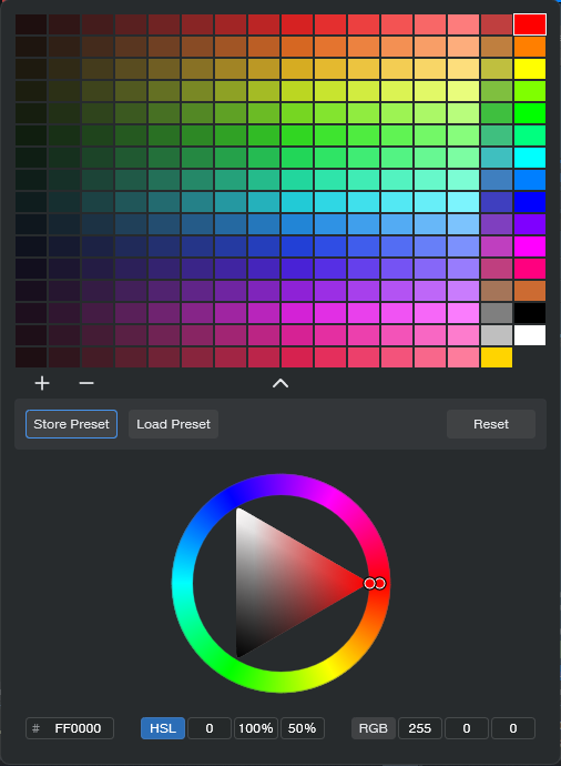
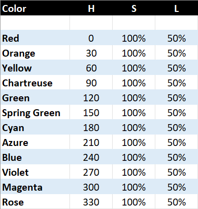
You can think of the spectrum of colors as a circle that starts at red, goes through the various colors, and ends up back at red. So, each color represents a certain number of degrees of rotation on that wheel. The number of degrees corresponds to the Hue (color), represented by the H in HSL. Each main color is 30 degrees apart along the wheel:
S represents the amount of saturation, from 0 to 100%. This defines the color’s vibrancy—with 100% saturation, the color is at its most vibrant. Pulling back on saturation mutes the color more. L is the luminance, which is basically brightness. Like saturation, the value goes from 0 to 100%. As you turn up luminance, the color becomes brighter until it washes out and becomes white. Turn luminance down, and the color becomes darker.
The Payoff of Custom Colors
Here’s why it’s useful to know the theory behind choosing colors. As mentioned at the beginning, I use two color variations for each group of tracks. For example, vocal tracks are green. I wanted bright green for lead vocals, and a more muted green for background vocals. For the bright green color, I created a custom color with HSL values of 120, 100%, and 50%. For the alternate color, I used the same values except for changing Saturation to 50%.
Fig. 2 shows the custom color parameter values used for the 12 main track groups. The right-most column in fig. 1 shows the main track group colors. The next column to the left shows the variation colors, which have 50% saturation. In the future, I’ll be adding more colors to the 12 original colors (for example, brown is the 13th color down from the top in fig. 1’s custom colors). Fortunately, the custom color feature lets you save and load presets.
The brain can parse images and colors more quickly than words, and this activity occurs mostly in the brain’s right hemisphere. This is the more intuitive, emotional hemisphere, as opposed to the left hemisphere that’s responsible for analytical functions like reading words. When you’re in the right hemisphere’s creative zone, you want to stay there—and v6.1’s track icons and custom colors help you do that.
But Wait…There’s More!
Don’t forget that Studio One also has overall appearance preferences at Options > Appearance. This is kind of like a “master volume control” for colors. If you increase contrast, the letters for track names, plugins, etc. really “pop.” For my custom colors, increasing the overall Luminance emphasizes the difference between the main track color and the variation track color.